Charts are a great way to diversify the contents of your SharePoint site, they can be used to show a particular dynamic, highlight one of your advantages as a company, and much more than that. And adding charts in SharePoint is not particularly hard, either. In fact, there are several different ways of doing that when it comes to a SharePoint Online page.
Two of the easiest ways to create a chart in SharePoint is to use a SharePoint’s own feature called “Quick chart”, and to use another feature called “File Viewer” to embed the file’s contents (a chart or a diagram, in our case) – in this particular scenario we’ll be using a “File Viewer” to display Excel chart in SharePoint.
That’s not to say that these are the definitive best ways to add a chart in SharePoint, it’s more about the ease of use, especially when other alternatives often have a prerequisite of additional knowledge on the subject or a skill to operate a specific software to a certain degree (like it is the case with Power BI and similar software that can embed itself in SharePoint).
Option 1 – Quick Chart
It’s safe to say that there would be some similarity in the first few steps of us adding a chart to SharePoint, one way or another. For example, our first step for both cases would be to get to the “Edit” mode of our SharePoint page. This can be done in two different ways – by clicking an “Edit” button on the upper-right part of the page, or by creating a new SharePoint page in the first place, which would get us into the “Edit” mode to modify the page in question before publishing it using the “Publish” button.
No matter which method of the two we’ll be using, the result should be us getting into the “Edit” mode of a SharePoint page that we want to create our chart on. The next step should also be similar for both cases – SharePoint’s “Edit” mode allows us to modify parts of the existing page, and to add various elements to these parts by clicking the “plus” icon that is usually located at the bottom of the targeted element. You may need to hover over the page part in question for the “plus” button to appear, though.
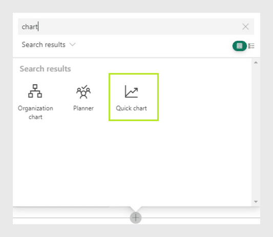
Clicking the “plus” button gives us a list of web parts that we can add to this particular page – with a few of the more common parts being put higher than others in the “Featured” section, and an A-Z list of all the other web parts right under the “Featured” section.
Luckily enough, there’s no need to scroll all the way down to the letter Q for us to get to the “Quick chart” web part – SharePoint also offers the ability to search for specific web parts if you know their names. This is how we get to the “Quick chart” web part, and it’s the beginning of us customizing our new chart in SharePoint.
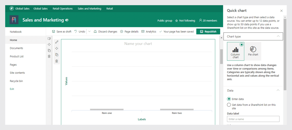
After adding it to your SharePoint page, a “Quick chart” web part generates a blank chart for you to work with. To start editing said chart, you have to press a small “pencil” icon at the upper left part of your new chart. This would bring an entire new menu to the right side of your screen.
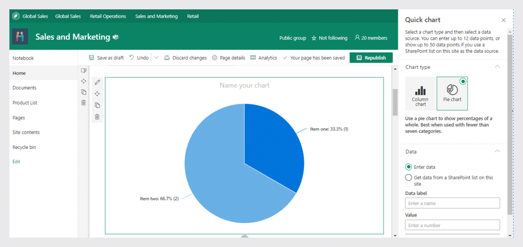
This menu allows you to customize basic details about your chart – chart type, data source, and so on. Since this web part is called “Quick chart”, its main purpose is to be quick, and not extensive, which is why there are only two basic chart types available there – a column chart and a pie chart.
There are also two main ways of putting information into your new chart – either manually or from a pre-made SharePoint list. You may have already seen that there is a small notice at the top of this new menu – it reminds you that the upper limit for manual data points is 12, and the same limit for data that you’re importing from a SharePoint list is 50.
You’re also free to customize the name of the chart, as well as the graph/column names (those are called “Labels” and “Values” in a blank chart). It should also be noted that the importing information from a SharePoint list is not a one-time transfer – your Quick chart is capable of updating itself whenever the SharePoint list in question changed its data in some way, and it changes the chart accordingly.
Option 2 – File Viewer (Excel)
The entire process is not particularly different when it comes to adding a chart from an Excel file. To start that, we need an actual Excel file with a chart in it – the process of creating that should be relatively obvious and it’s not exactly the point of this article, so we’ll just assume that you already have an Excel file that has a table of information and a chart that you’ve created inside Excel based on said information.
But we’ll probably have that file saved on your local machine, and not in SharePoint. This is easily fixable – there is a dedicated tab that you can find within your SharePoint library called “Documents”. This tab allows you to both create new documents and upload existing ones from different locations. Here you’ll have to choose the “Upload” button and find your local Excel file with a chart inside of it. After the upload process is complete and you can see the document inside of this tab – we’re free to proceed.
Next, we’re going to go over two steps that we’ve mentioned before – going to the “Edit” mode of your SharePoint page and clicking on the “plus” icon to bring in the list of web parts to add to your web page. To display Excel chart in SharePoint, we’re going to choose a “File Viewer” option here.
A “File Viewer” option brings up a new floating window that lists several different places for you to grab a document from – including stock images, OneDrive cloud, your local machine, a hyperlink, and so on. Since we’ve uploaded our Excel file fairly recently, we should see it front and centre in the “Recent documents” field. Choosing the said file allows us to continue our efforts to display Excel chart in SharePoint.
However, that’s not the end of it all, either. After choosing the file in question, SharePoint would load your entire Excel file into your SharePoint page. Chances are that you don’t want to see the entire file and just want to get the chart itself – we can do that, too.
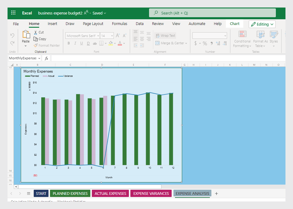
To get SharePoint to view only a specific part of your Excel document, you have to know the name of the chart, first. You can find the name of your chart by accessing your Excel file (either locally or inside of SharePoint’s document library) and clicking on the chart in question.
After the focus in Excel is switched to your chart, you should be able to see the name of said chart in the upper left part of the screen, just a bit to the left of the “formula” field. If you did not change it in the first place, there’s a good chance it would be named as “Chart 1”, “Chart 2”, or something similar.
Knowing the name of your chart, you can go back to SharePoint and click the “pencil” icon to the left of your newly-added Excel table, just like we did with the “Quick chart”. Doing this allows you to gain access to a new menu to the right side of the screen which allows us to choose which part of the file to show on a SharePoint page.
Choosing “Chart” instead of “Entire workbook” would prompt you to input the name of the chart you want to see – and, if the input was correct, your web part should change itself from an Excel file to just a single chart.
Conclusion
When compared directly, both Quick chart and File Viewer are a great way to add a chart to your SharePoint page. Each has its own downsides, of course – with Quick chart being somewhat limited in its capabilities, while attempting to display Excel file in SharePoint does not seem as natural as creating an entire chart in SharePoint (in fact, it also shows where the chart is coming from when using File Viewer, so it’s not as seamless as the other option.
However, there are also advantages that each option has, as well, such as the Quick chart’s ability to generate charts with zero prior knowledge or training, or File Viewer’s ability to utilize the advantages of a much more versatile and customizable chart editing tool such as Excel.